Customizing Shopify App Block Styles
Introduction
Retail Cloud Connect™ App Blocks include default storefront styles. Merchants, developers, and agencies can add small CSS overrides in the Shopify theme editor or a theme stylesheet to match storefront branding.
The Search Results and Product Grid collection App Blocks share most styling hooks because both use AI Commerce Search. Recommendations AI uses a different App Block container, but product cards share many of the same product-card class names.
Default Styles Available
The Retail Cloud Connect Shopify App includes default styles so merchants can get started with no code, or add custom CSS when needed. Nimstrata also works with Shopify agencies on custom storefront implementations. Schedule a call to learn more.
Custom Styling
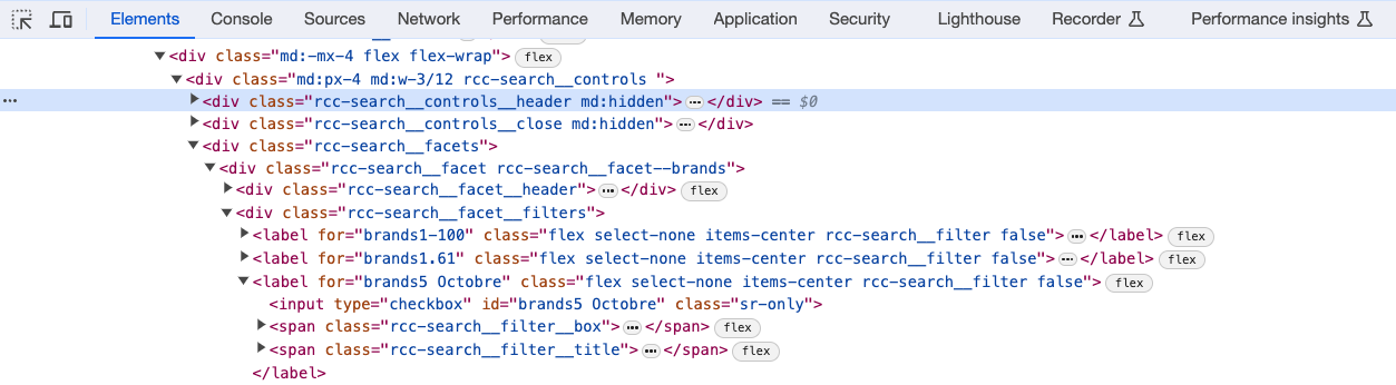
Each App Block has CSS classes that follow the BEM, or Block Element Modifier methodology. Retail Cloud Connect classes use the rcc prefix, followed by the App Block type, component, and state.
Common Search Results and Product Grid collection selectors include:
The noResults class is added to the same section as filtersVisible or filtersHidden, so styles can combine those states, for example .filtersVisible.noResults.
An explicit Filters & Data display style adds a semantic modifier to the facet, including .rcc-search__facet--display-list, --display-grid, --display-swatches, or --display-range. Theme default adds no modifier. Keep theme CSS defaults modifier-free, and scope hard-coded theme treatments so an explicit modifier can override them.
Shared CSS Classes
Collection pages and search results are powered by the same AI Commerce Search functionality, so Search Results and Product Grid Collection Page App Blocks share CSS class names.
Studio Theme Overrides
When an App Block uses the Studio style, override Studio CSS variables before writing component-specific selector rules. Variables keep colors, spacing, image treatments, loading placeholders, product cards, drawers, and modals aligned.
Studio Theme Variables
The Studio style exposes CSS custom properties on the App Block root. For Search Results and Product Grid collection App Blocks, the root selector is .rcc-search[data-theme='studio'].
Set variables on the App Block root when the change should apply across the full App Block, including loading placeholders and no-JavaScript fallback markup. Use direct class selectors only for component-specific changes that a Studio variable does not cover.
The CSS Wrapper Class App Block setting adds a class inside the App Block. It is useful for narrow product-grid or content styling, but Studio variables that should affect loading placeholders should be set on .rcc-search[data-theme='studio'] or another selector that reaches the App Block root.
Common Studio variables include:
The Product image aspect ratio App Block setting controls --rcc-studio-product-image-aspect-ratio. Prefer that setting for image ratio changes because the App Block writes the value on the root element for loading, fallback, and hydrated product cards.
Studio keeps the desktop sidebar scrollbar clear of filter values and keyboard focus outlines. Scrollbar track and thumb color overrides apply in Firefox, Chrome, Edge, and Safari. The pixel width variable applies in Chrome, Edge, and Safari; Firefox uses its browser-defined thin width.
Studio Theme Example
The example below customizes Search Results and Product Grid collection App Blocks that use the Studio style. Add the custom CSS after the Retail Cloud Connect App Block styles, such as in the theme stylesheet or Shopify custom CSS.
.rcc-search[data-theme='studio'] {
  --rcc-studio-font-family:
    var(--font-body-family, Inter), ui-sans-serif, system-ui, sans-serif;
  --rcc-studio-color-text: #1f1d1a;
  --rcc-studio-color-muted: #6b6259;
  --rcc-studio-color-subtle: #8c8178;
  --rcc-studio-color-accent: #7a4e2d;
  --rcc-studio-color-background: #fffdfa;
  --rcc-studio-color-surface: #f7f2ec;
  --rcc-studio-color-surface-strong: #eee3d7;
  --rcc-studio-color-border: #d8cbbf;
  --rcc-studio-color-border-strong: #1f1d1a;
  --rcc-studio-color-focus: #1f1d1a;
  --rcc-studio-product-image-bg: #f4eee6;
  --rcc-studio-product-image-fit: contain;
  --rcc-studio-product-card-radius: 6px;
  --rcc-studio-product-image-radius: 6px;
  --rcc-studio-control-radius: 4px;
  --rcc-studio-pill-radius: 999px;
  --rcc-studio-grid-column-gap: clamp(12px, 2vw, 24px);
  --rcc-studio-grid-row-gap: clamp(28px, 4vw, 48px);
  --rcc-studio-page-inline-padding: clamp(16px, 4vw, 64px);
  --rcc-studio-page-block-padding: clamp(20px, 3vw, 36px);
  --rcc-studio-page-max-width: 1500px;
  --rcc-studio-sidebar-scrollbar-width: 4px;
  --rcc-studio-sidebar-scrollbar-track-color: #eee3d7;
  --rcc-studio-sidebar-scrollbar-thumb-color: #1f1d1a;
  --rcc-studio-swatch-size: 28px;
}

.rcc-search[data-theme='studio'] .rcc-search__product__title {
  font-weight: 600;
}

.rcc-search[data-theme='studio'] .rcc-search__product__price {
  margin-top: 2px;
}
The first rule changes the Studio theme tokens for the whole App Block. The two component rules are intentionally small and scoped to Studio product cards because no Studio variable controls those exact text treatments.
For content inserted between product cards, use the App Block-owned .rcc-search__grid-content wrapper, its data-rcc-grid-content identifier, or the custom class configured for that entry. See Content Inside Search and Collection Grids.
For Recommendations AI App Blocks that use Studio, apply the same --rcc-studio-* variables on a scoped [data-theme='studio'] selector for the recommendation block.
Customizing Dynamic Autocomplete
Dynamic Autocomplete renders under its own class namespace, .rcc-dynamic, separate from the search grid (.rcc-search) and the legacy Keyword Autocomplete (.rcc-auto). The dropdown is a native <dialog> element that the browser places in the top layer, and every color, radius, and spacing decision inside it reads from a CSS variable, so most stores can restyle it without touching a single component selector.
Start with the design variables
All variables are defined on the .rcc-dynamic root, so overriding them in your theme's custom CSS restyles the whole experience at once:
.rcc-dynamic {
  --rcc-dynamic-auto-color-accent: #8c2f1e; /* brand color for links and actions */
  --rcc-dynamic-auto-color-highlight: #f6e3d7; /* typed-prefix highlight */
  --rcc-dynamic-auto-row-radius: 10px;
  --rcc-dynamic-auto-font-family: var(--font-body-family);
}The variable prefix is --rcc-dynamic-auto-* for compatibility with earlier releases, while class names use the shorter .rcc-dynamic namespace.
Component selectors
When a variable does not cover what you need, target the BEM selectors. The most useful ones:
Section modifiers let you style one surface without touching the others: .rcc-dynamic__section--suggestions, --brands, --navigation, --products, --default-products, --default-best-sellers, --default-recommendations, and --loading. Layout modifiers on the root distinguish the two dialog positions: .rcc-dynamic--layout-floating (centered) and .rcc-dynamic--layout-top (full width at the top).
For example, hiding brand rows' pill badges and tightening product cards only in the floating layout:
.rcc-dynamic__section--brands .rcc-dynamic__action-meta {
  display: none;
}

.rcc-dynamic--layout-floating .rcc-dynamic__product-card {
  border: none;
  box-shadow: 0 1px 4px rgba(0, 0, 0, 0.08);
}
Dialog and backdrop rules
The dropdown is a native <dialog> in the browser top layer. Do not add position: fixed wrappers or arbitrary z-index values to force stacking, and do not restyle the backdrop with overlay elements. Dim or tint the page behind the dialog with the --rcc-dynamic-auto-backdrop variable, or scope backdrop rules to .rcc-dynamic__dialog::backdrop.
Use the Position, Trigger Selectors, and product-count settings on the app's Autocomplete settings page rather than CSS when a setting exists for what you are changing: settings survive app updates and apply to the markup before it renders.
Custom CSS Guidelines
- Keep overrides scoped to
.rcc-search[data-theme='studio']or another App Block-specific selector. - Prefer Studio variables for colors, spacing, radii, typography, image fit, swatch sizing, and transitions.
- Avoid copying the full Studio theme CSS into a storefront theme. Small overrides are easier to maintain when Retail Cloud Connect ships improvements.
- Use the App Block Product image aspect ratio setting instead of overriding
--rcc-studio-product-image-aspect-ratioin a stylesheet. - Test search, collection pages, loading states, filters, sorting, pagination, and mobile drawer filters after changing styles.
Inspecting Elements
The fastest way for most front-end developers to get started is to install an App Block, inspect each element, then edit a custom stylesheet.